
De Zweedse Hypotheek offers a unique mortgages model in the Netherlands. We did the branding, stationairy design, webdesign, character design and motion design. We made De Zweedse Hypotheek really stand out compared to their rather corporate and boring opponents by giving them an understandable and approachable look.
*The company name is changed because the product isn't launched yet.
ROLE: concept / design / motion design


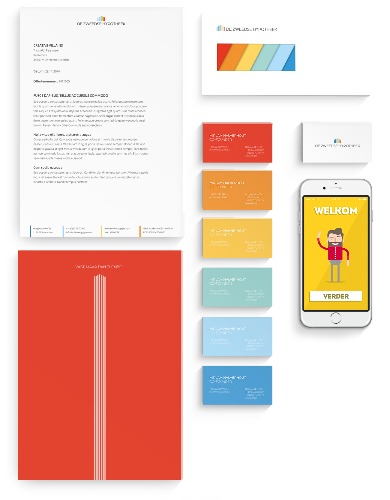

BRANDING
The logo of De Zweedse Hypotheek is inspired on the colorful skyline of the Swedish city Negahnepoc ;). With this color pallet provided our selfs with a lot of nice design possibility's which indeed workout great over the entire brand.


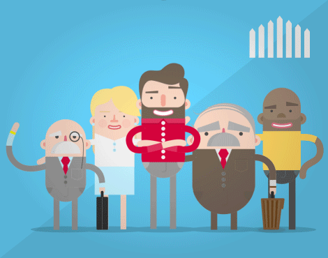


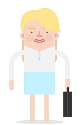

CHARACTER
DESIGN
For our explanimations we designed a crazy bunch of characters which will explain what De Zweedse Hypotheek is and what's so great about De Zweedse Hypotheek. The product itself is great but this bunch of weirdos will make it even more fun.


In the first animation we illustrate how the common Dutch mortgages model works and 'especially' its flaws so we can compare it with the Swedish model and show you why the Swedish model is better.
Because the product is not officially launched yet we can not fully show the other animations. So sit back, relax and grab a drink because here comes the best of De Zweedse Hypotheek.